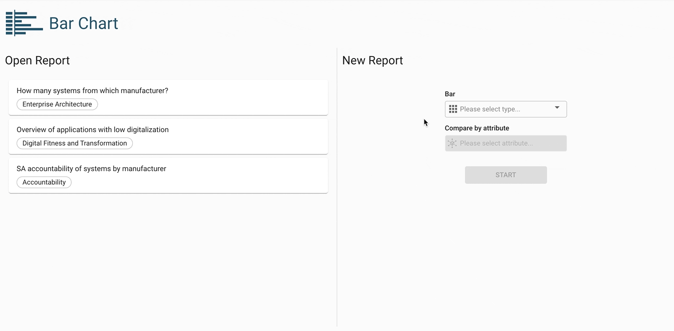
Bar chart diagram
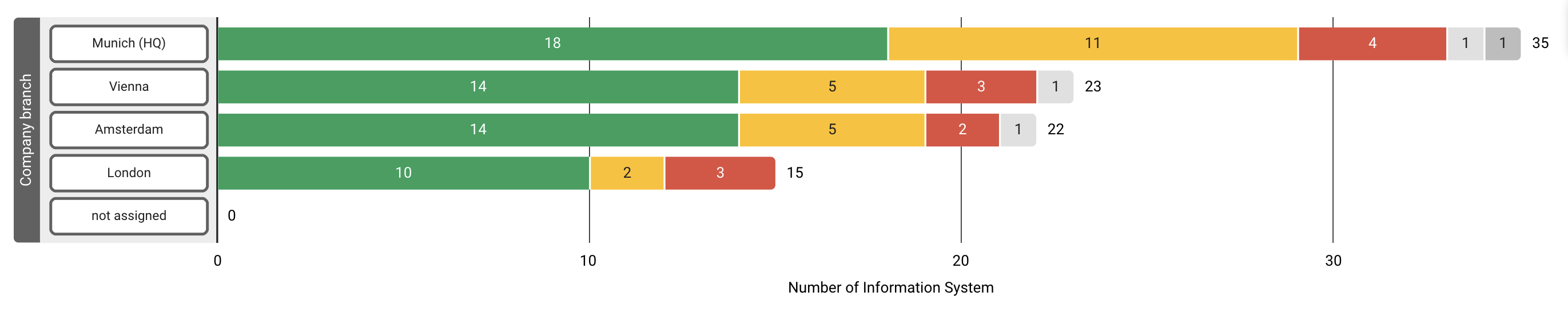
Visualize the number of elements in a building block type and compare them by attribute. This diagram displays a classical bar chart, with its bar width according to the quantity of building blocks that share the same attribute value.
Example use case
You want to visualize how many information systems are being used in each branch of the organization and at the same time note their technical state of health.
Configuring building block types and attributes
Start by choosing a building block type and attribute. The diagram visualizes the number of elements within that building block type, distributed in rows for each attribute value.
Coloring may be applied by an additional attribute, which segments the bar of each row into different colors according to the element’s attribute values. The diagram can be further customized by applying filters and changing the sorting order.
Additional display options
Empty bars excluded: By default, the diagram shows a bar for attribute values even if the building block quantity is zero. By enabling this option, these bars are hidden.
Bar labels excluded: By default, the diagram shows a quantity label at the end of each bar. By enabling this option, these labels are hidden.