Pie chart diagram
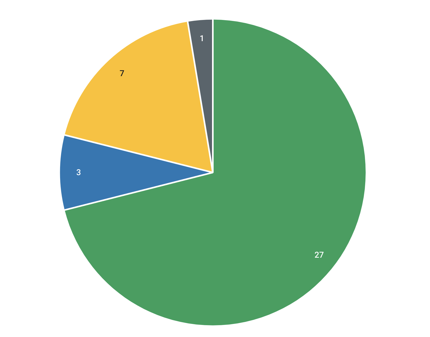
Visualize the distribution of attribute values within a certain building block type. This diagram displays a classical pie chart, with slices proportional to the quantity of building blocks that share the same attribute value.
Example use case
For data maintenance purposes, you want to get an overview of the number of building blocks that have a certain attribute value assigned.
Configuring building block type and attribute
Start by selecting the building block type and attribute. The diagram visualizes the value distribution for that attribute on the chosen building block type. The arc length of each slice in the pie chart is proportional to the quantity of building blocks sharing the same attribute value.
Customize the diagram by applying filters and changing the sorting order.
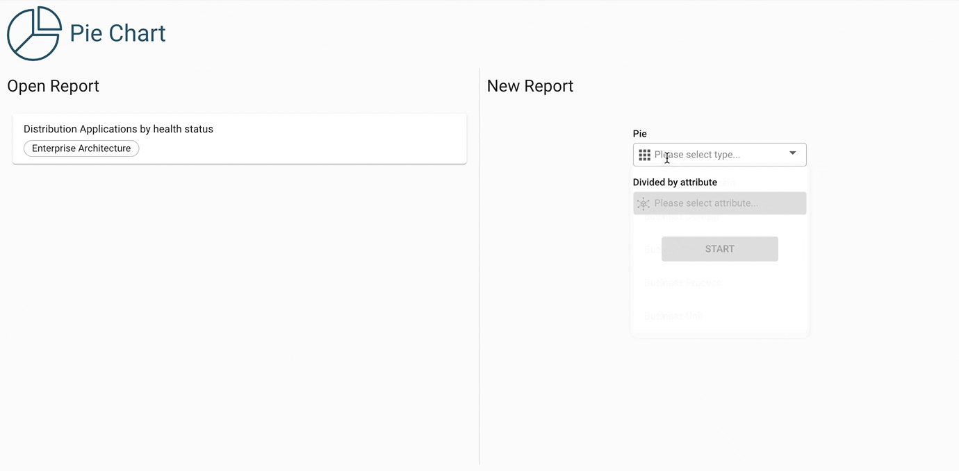
Additional display options
Segment labels excluded: By default, the diagram shows a quantity label on each slice of the pie. By enabling this option, these labels are hidden.