Navigation through our new frontend made easy
October 2023
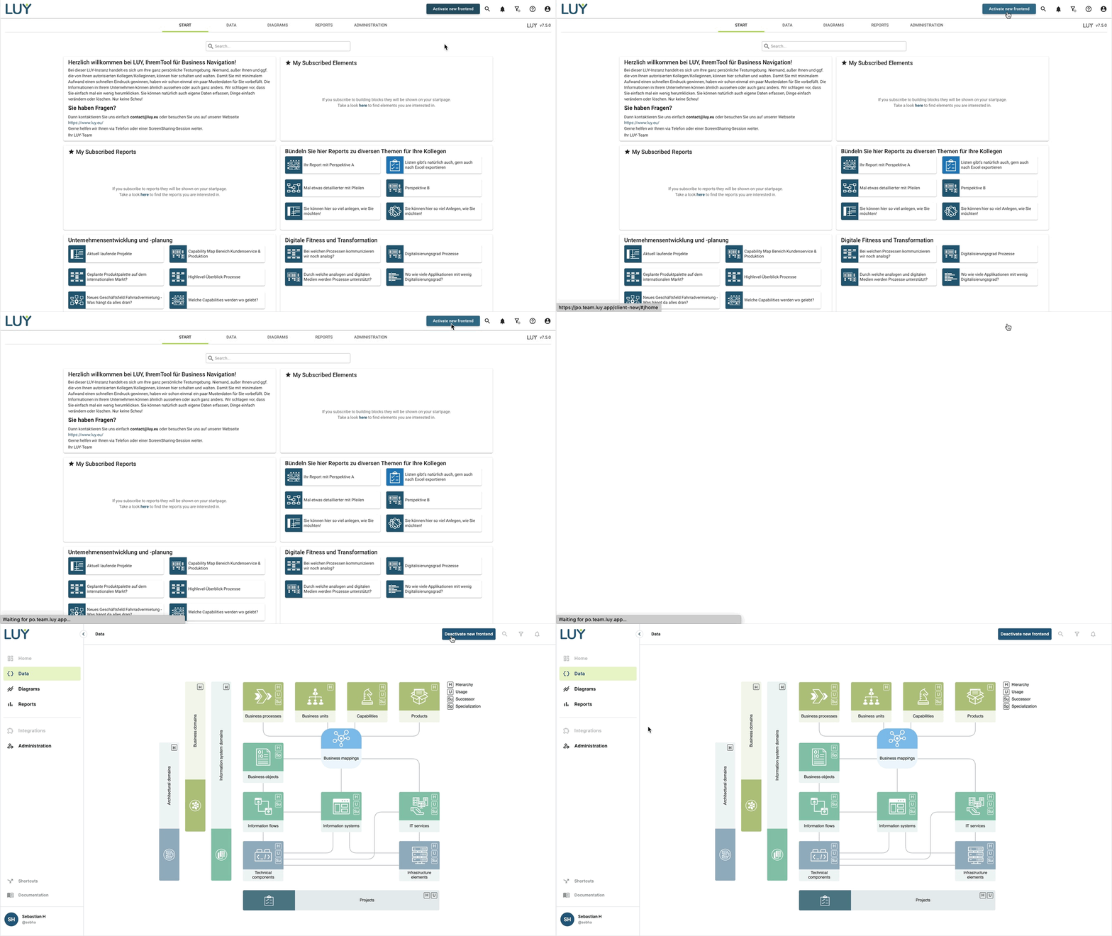
The navigation layout of our new frontend has been rebuilt and redesigned in order to make it easier and more intuitive to move around in LUY.

A full description of all the features accessible via the menu and how they work in the previous version can be found here: Getting started.
For this release, not everything in the new frontend is ready yet. Parts that are not yet implemented (like search, notifications, and global filters) are therefore greyed out. Stay tuned for future releases.
Features
While the top right corner continues to be the place to find your search, notifications and set global filters, the main navigation has been moved to the left to make more space for content like reports and diagrams.
Sidebar
On the left, you will find links to the home page, data, diagrams, reports, integrations and administration.
We have regrouped, reordered, and renamed these groups to better fit together so that tnew users will find it more intuitive.
For example, the former reports group has been renamed to integrations to indicate that here are kinds of features grouped that are integrated into LUYs core features (like the plugin API or surveys that make use of LUY’s data).
At the same time, reports now links to the former reports list tile. As the reports page shows all reports from LUY that you have access to - no matter the type - this should be your fastest and easiest way to dive into a report without thinking first about the diagram or building block type.
Shortcuts and help
The link to our help center has been separated from customizable shortcuts to make it easily accessible for new users.
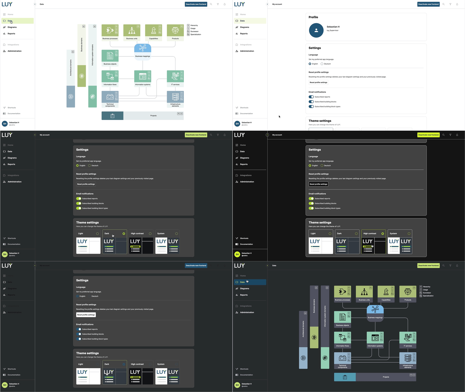
My account and themes
Bottom left is where your account settings are located. Besides having access to regional settings, the new frontend now also allows you to change the theme of LUY. LUY comes with the classic light theme, but a new dark theme makes LUY easier on the eyes, and the new high contrast theme is even more useful for visually impaired users by increasing the contrast of the interface and using more bright colors.
Tipp: If you set the theme to system, LUY will automatically use the theme set in your operating system, blending in perfectly.

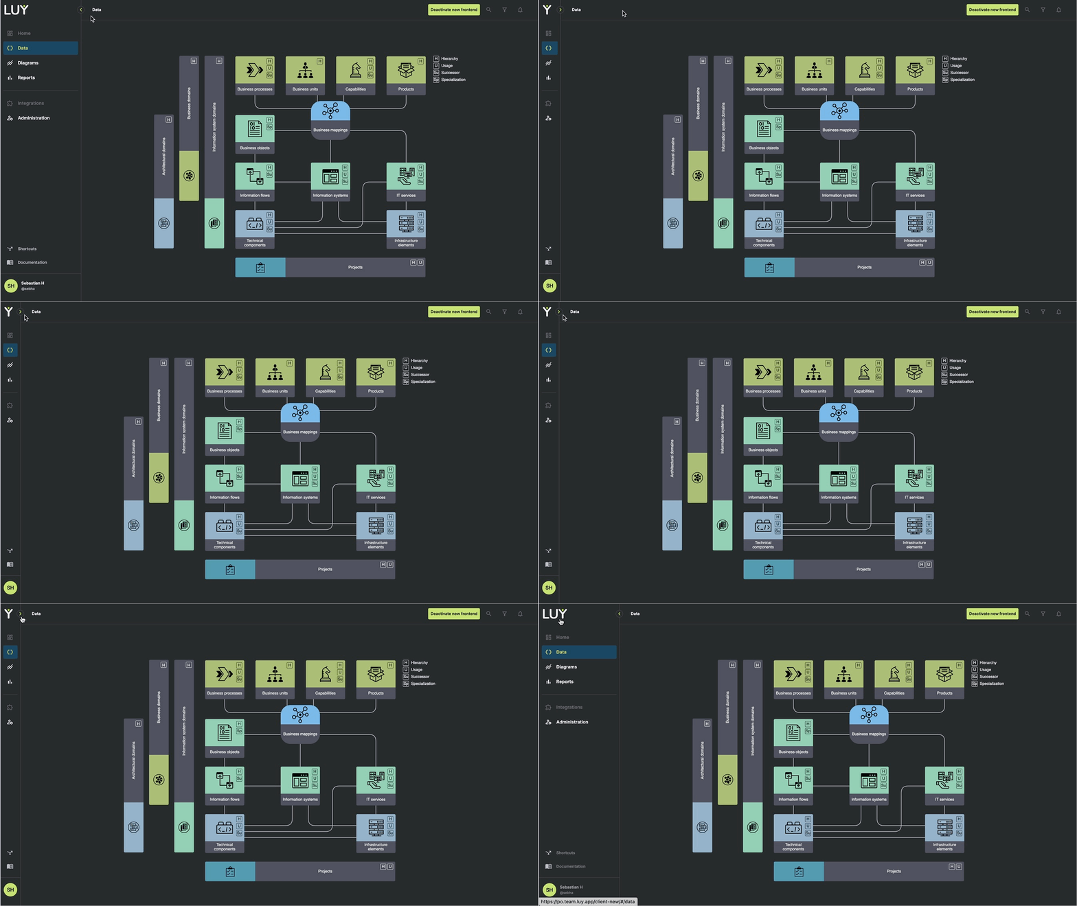
Minimize
Finally, if you want to have even more room for your content, you can minimize the navigation sidebar to only show icons.

Limitations
Be aware that for this first iteration our new frontend does not yet support every feature known to you in our previous LUY solution. These features will follow shortly.
Search, notifications, and global filters are not yet implemented. These icons are therefore greyed out.
The shortcuts logic is not yet fully implemented, this means that LUY can only open complete URLs (like http://www.google.com) and not yet automatically resolve them (a shortcut set for google.com will therefore not yet work).
