Single element view (Nova)
The single element view displays all information about an element and is available for all building block types, except business mappings. It can be accessed from the table view or any diagram by clicking on the name of an element.
The single element view is divided into three tabs:
Overview
Attributes
Relations
The name of the opened element is displayed at the top of the screen and in the breadcrumb navigation, regardless of which tab is currently active.
Overview
The overview tab displays the following system attributes, providing a high-level and currently read-only view of the opened element:
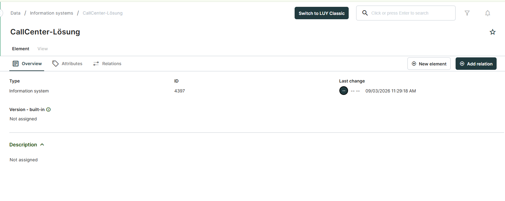
Type: Indicates the building block type to which the element belongs.
ID: The unique identifier of the element.
Last change: Displays the date and the LUY user who made the last modification to the element.
Version - built-in (only for information systems and technical components): In LUY, all characters following the "#" in the name of information systems and technical components are interpreted as the version number. This value is shown here.
Description: The description of the element.
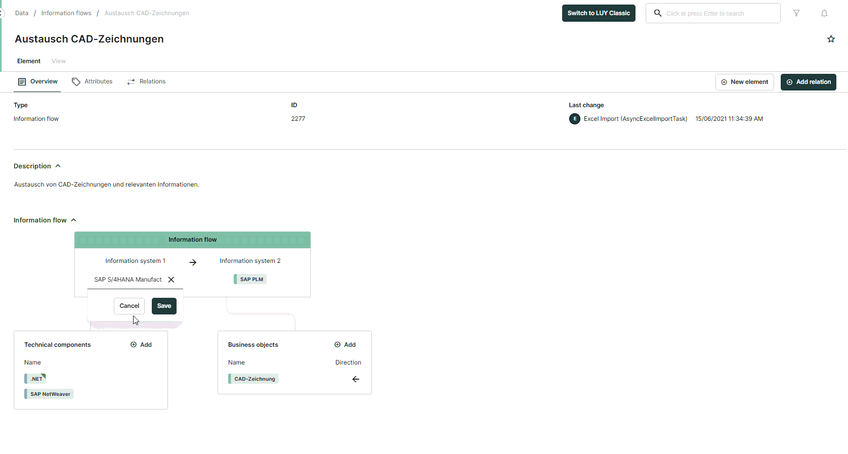
Information flow overview
In the overview tab of the building block type information flow, a graphic representation provides a preview of the current information flow. On mouse over, the direction of the information flow or connected business objects is described.
Click into the overview to replace information systems, add used technical components and transported business objects or change the direction of the information flow.
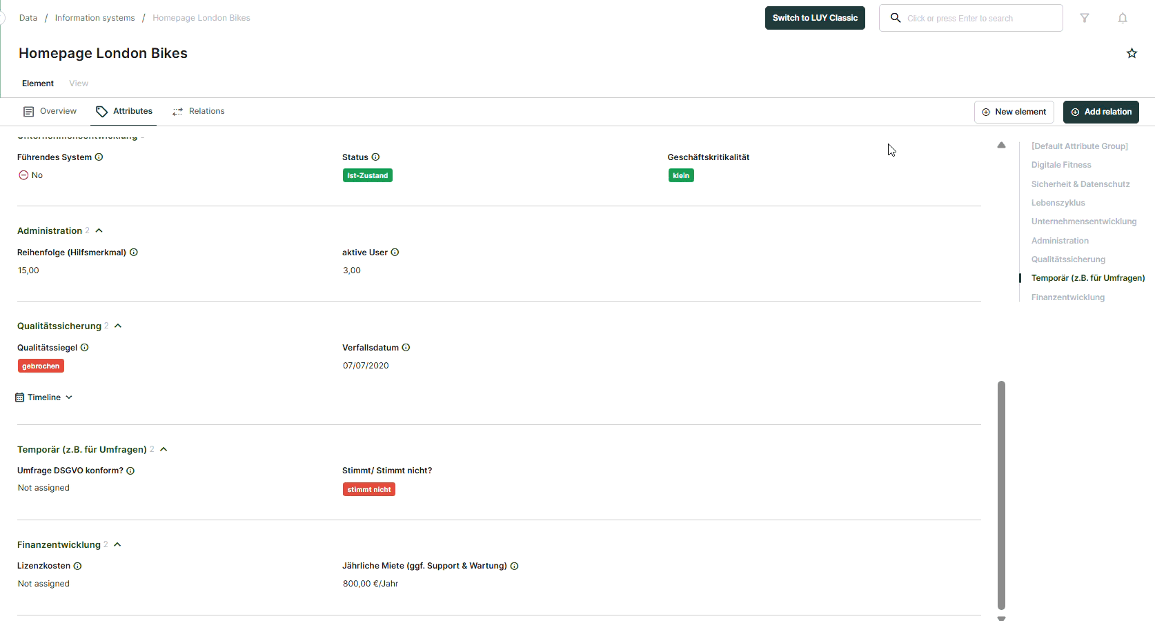
Attributes
The attributes tab displays all attribute groups and assigned attributes to the building block type that are accessible to the logged in user.
Navigating through the attributes tab
To quickly locate a specific attribute, click on the corresponding attribute group on the right. This will navigate you directly to the selected attribute group.
All attribute groups can be collapsed at once using the “collapse all” function. This collapses all attribute groups on the page, allowing the user to open only the specific ones needed.
When the attribute groups are collapsed, the “collapse all” function changes to “expand all.” Clicking it will expand all attribute groups on the page.
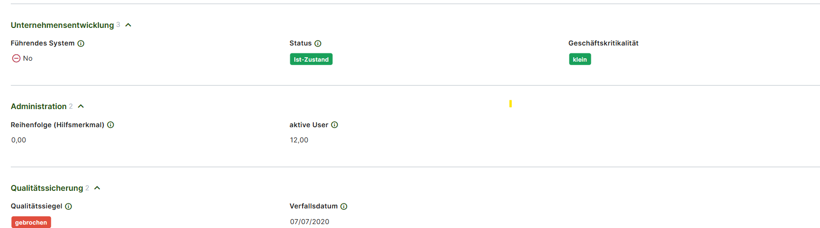
The attributes displayed on the attributes tab provide additional visual information based on their attribute type:
Enumeration attribute: The colors associated with the selected values are displayed, enabling the user to quickly interpret key information. In order to change the color of a value, switch to legacy and adjust the attribute in the administration: Attribute and attribute groups | Enumeration-attributes
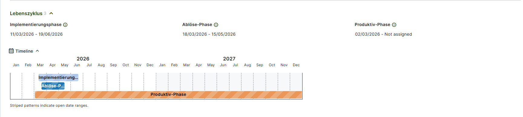
Date and Date interval attribute: When a date or date interval attribute is set, a “Timeline” graphic is displayed at the end of the corresponding attribute group. This timeline visually represents all date and date interval attributes within the group, providing a clear overview of their distribution.
Edit attributes
Clicking an attribute opens the edit dialog, allowing modifications to the specific element. To save changes use the “Save” button.
In the single element view, the following attribute types can be edited.
Name: In the single element view, the name of the element can be edited by clicking on it.
Enumeration or responsibility attributes:
These attributes can be set using preconfigured values. To set a value, select the desired entry. Autocomplete and search features are available to quickly locate specific values. If "multiple values" is active for the attribute, multiple values can be added. To remove an entry, click the "x" next to the value’s name.Numeric attributes:
Numeric values can be entered directly. If an “Upper” or “Lower” bound is set, it will be displayed in the edit dialog. Numeric values outside the specified bounds cannot be saved.Date attributes:
Date values can be set using the date picker or entered manually. To select a date using the date picker, click on the calendar icon.Date interval attributes:
Date intervals can be set using two date pickers or by manual entry. The ability to edit the start or end date depends on the assigned date attribute, which may disable one of the fields.Boolean attributes:
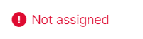
Boolean attributes can be set to “Yes”, “No”, or “Not assigned”. If “Not assigned” is selected, the field will appear empty.Text attributes:
Plain text attributes can contain up to 255 characters and don’t allow any formatting.
An attribute can be designated as a “Mandatory attribute” in the attribute settings. If the attribute is empty or not assigned, it will be highlighted in red with an exclamation mark to indicate it is missing.
Multiline text attributes:
Multiline text attributes and descriptions, a default attribute for every building block type in LUY, can contain more text than a plain text attribute. You can use different formatting options provided in the editor’s toolbar:
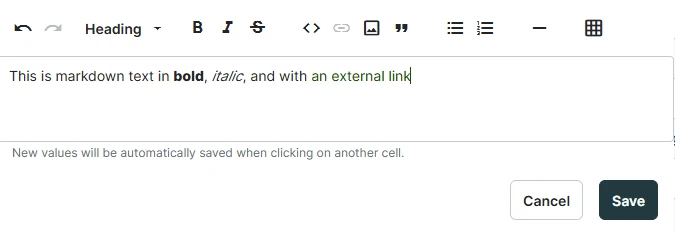
To start editing:
Click on a multiline text field.
The editor’s toolbar appears at the top, offering formatting options.
Begin typing in Markdown syntax or use the toolbar for quick formatting.
Click Save to apply your changes.
Text formatting
The editor supports various Markdown elements for text formatting, links, lists, tables, images, and more.
Formatting | Syntax example | Rendered output |
|---|---|---|
Bold |
| LUY markdown |
Italic |
| Markdown editor |
Strike through |
|
|
Code snippet |
|
|
Quotes |
|  |
Bullet lists |
CODE
|
|
Numbered lists |
CODE
|
|
Tables |
CODE
| 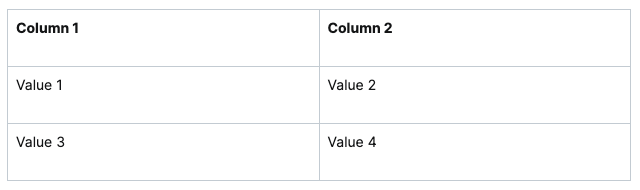 |
Links |
| |
Images |
|
 LUY Logo |
Horizontal rules |
| 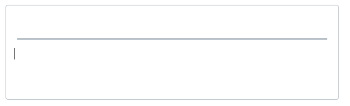 |
Headings 1-6 |
CODE
| 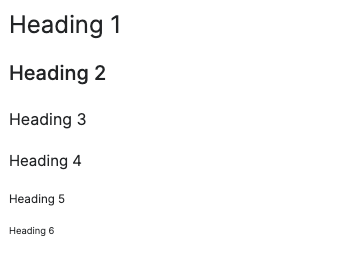 |
Paragraph This is your default text style. | paragraph | paragraph |
Accessibility and keyboard navigation:
Tab moves the cursor to the next interactive element, except in lists where it creates a new indentation.
Shift+Tab moves the focus to the previous toolbar button.
Enhanced copy-paste support:
Copying between LUY markdown editors preserves formatting.
When pasting from external tools (JIRA, Confluence, Word, etc.) formatting is retained as closely as possible.
When pasting into tables only plain text is retained to prevent breaking structure.
Limitations:
Line breaks in tables are not supported. Tables must contain only inline elements.
Dragging images into the editor is not supported. Only external image links are allowed.
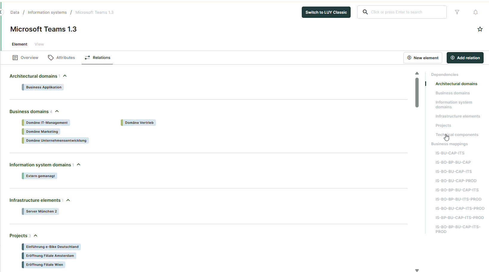
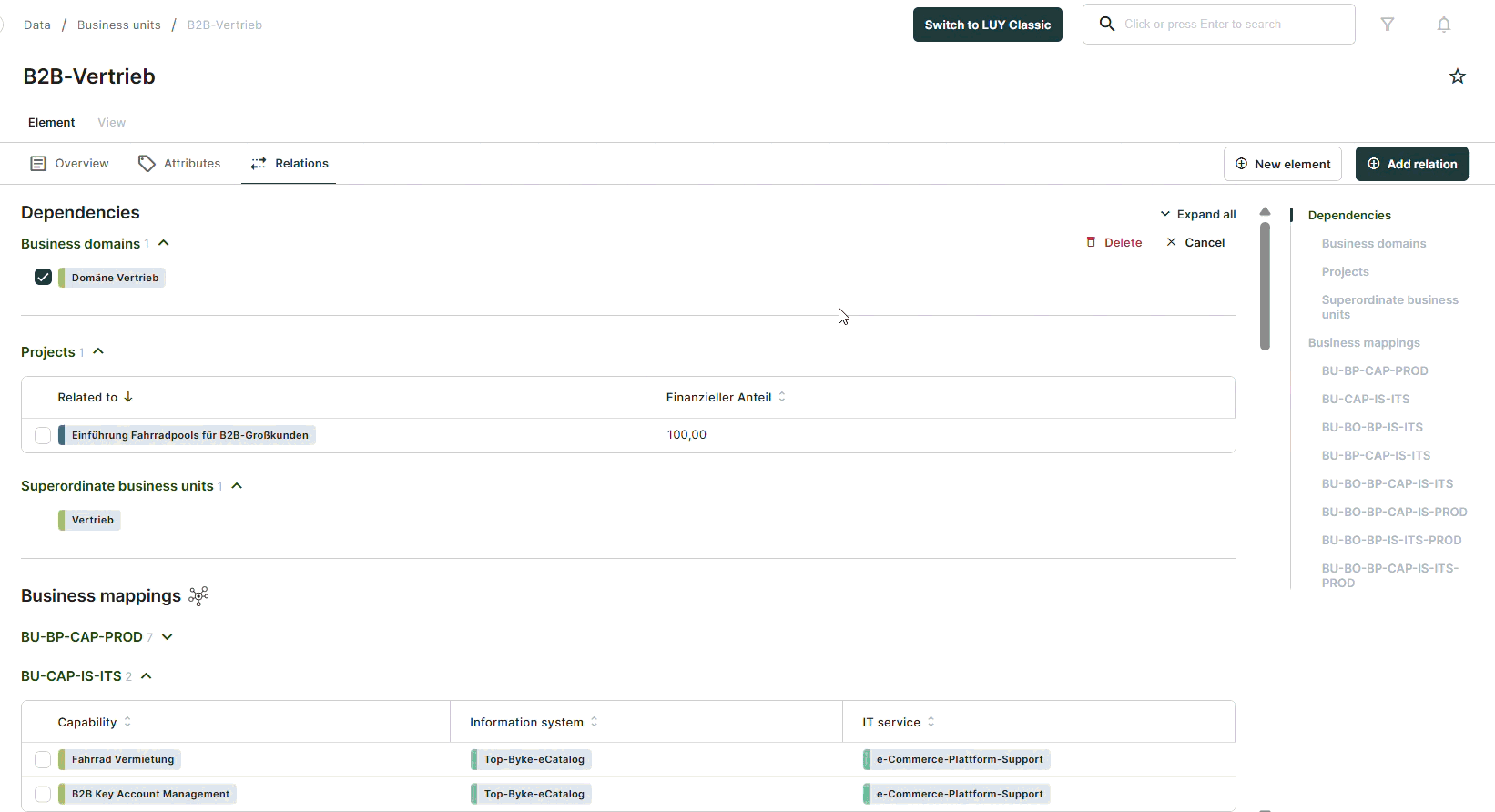
Relations
The relations tab displays all relations, business mappings and relation attributes related to the building block type that are accessible to the logged in user.
Navigating through the relations tab
To quickly locate a specific relation, click on the corresponding entry on the right. This will navigate directly to the selected relation.
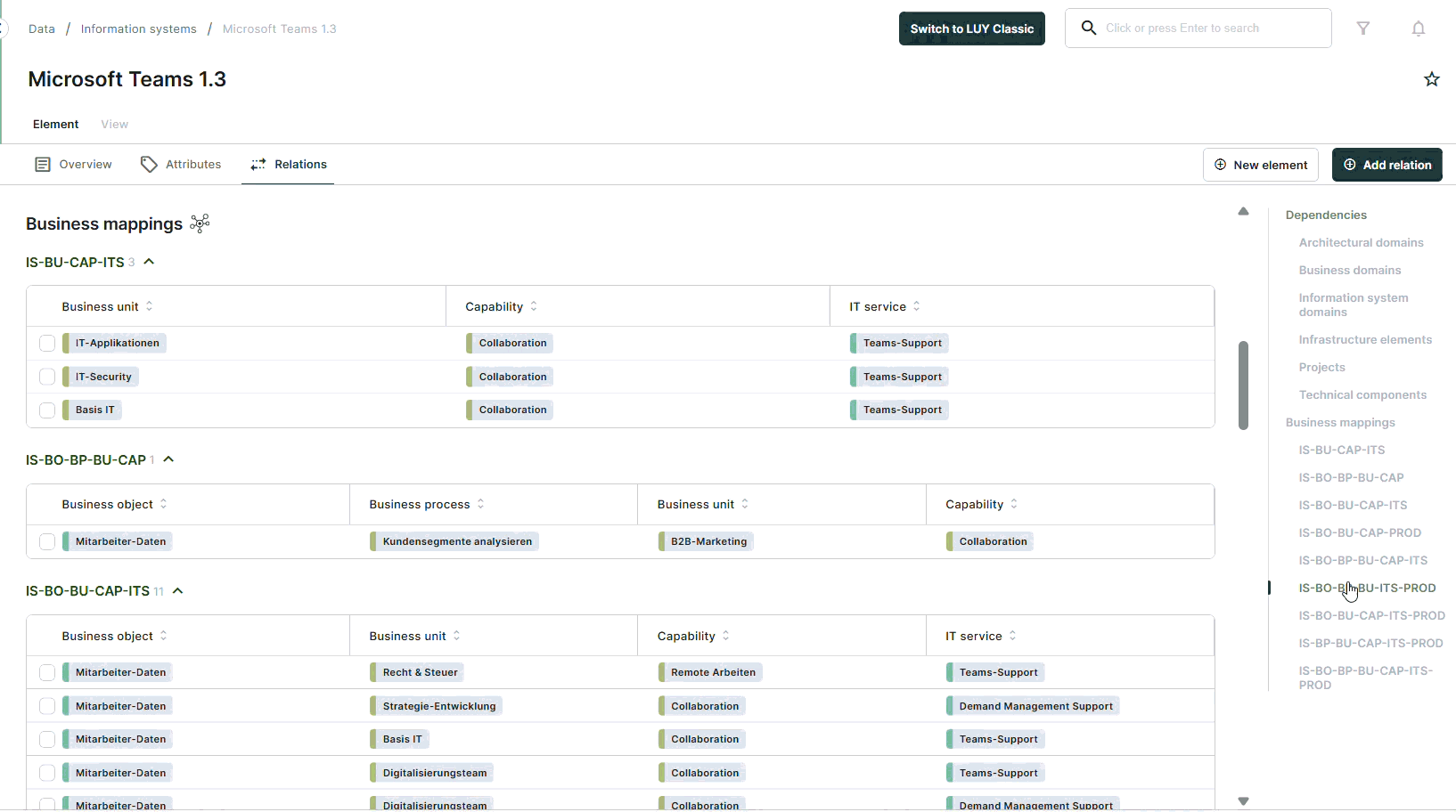
All relations and business mappings can be collapsed at once using the collapse all function. This collapses all relations and business mappings on the page, allowing the user to open only the specific ones needed.
When the relations or business mappings are collapsed, the collapse all function changes to expand all. Clicking it will expand all relations and business mappings on the page.
Edit relation attributes
Attributes assigned to a relation or business mapping can be edited just like editing any other attribute in the table view.
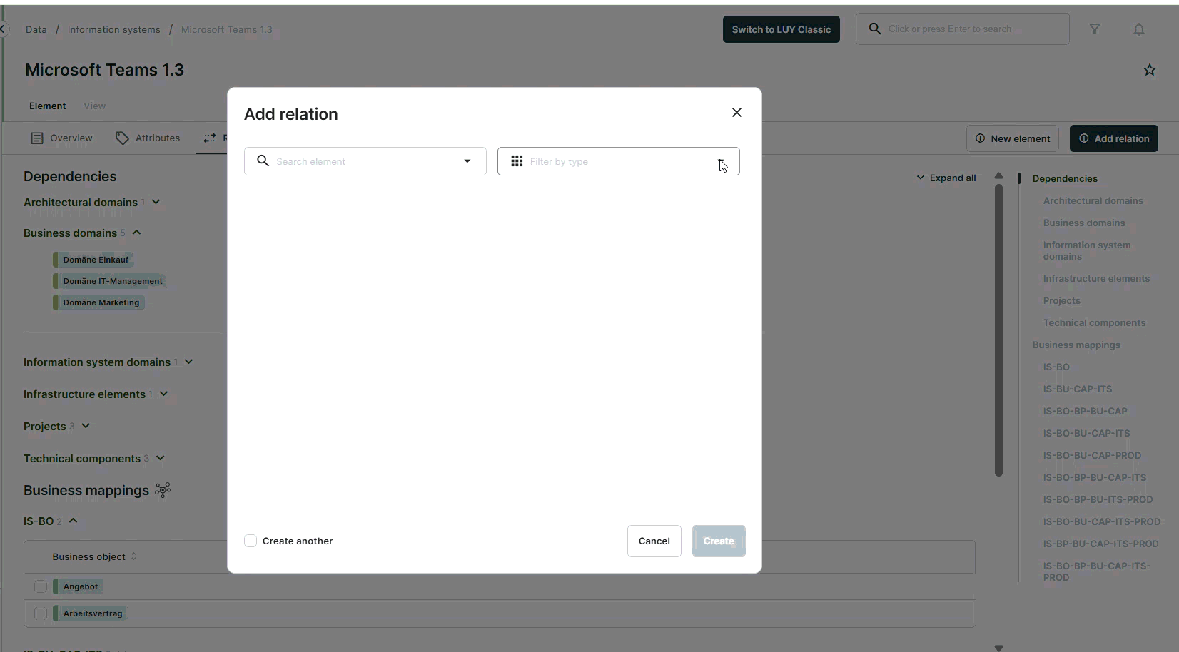
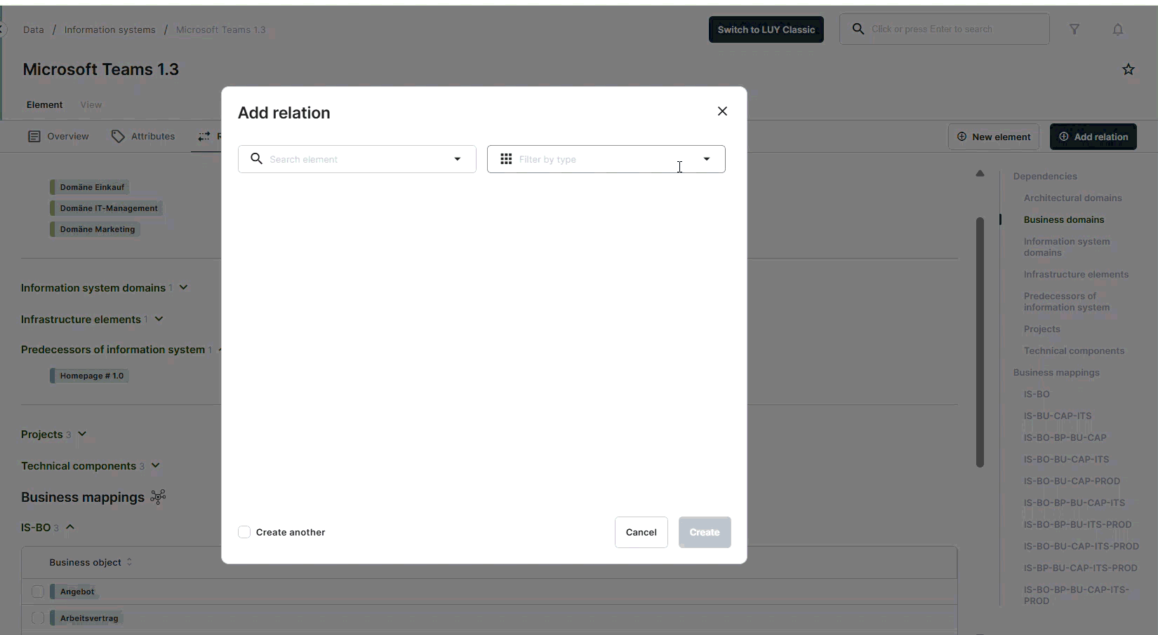
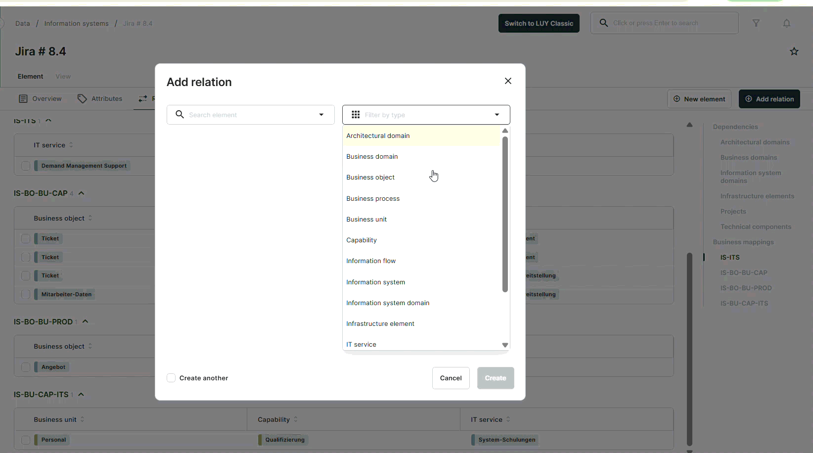
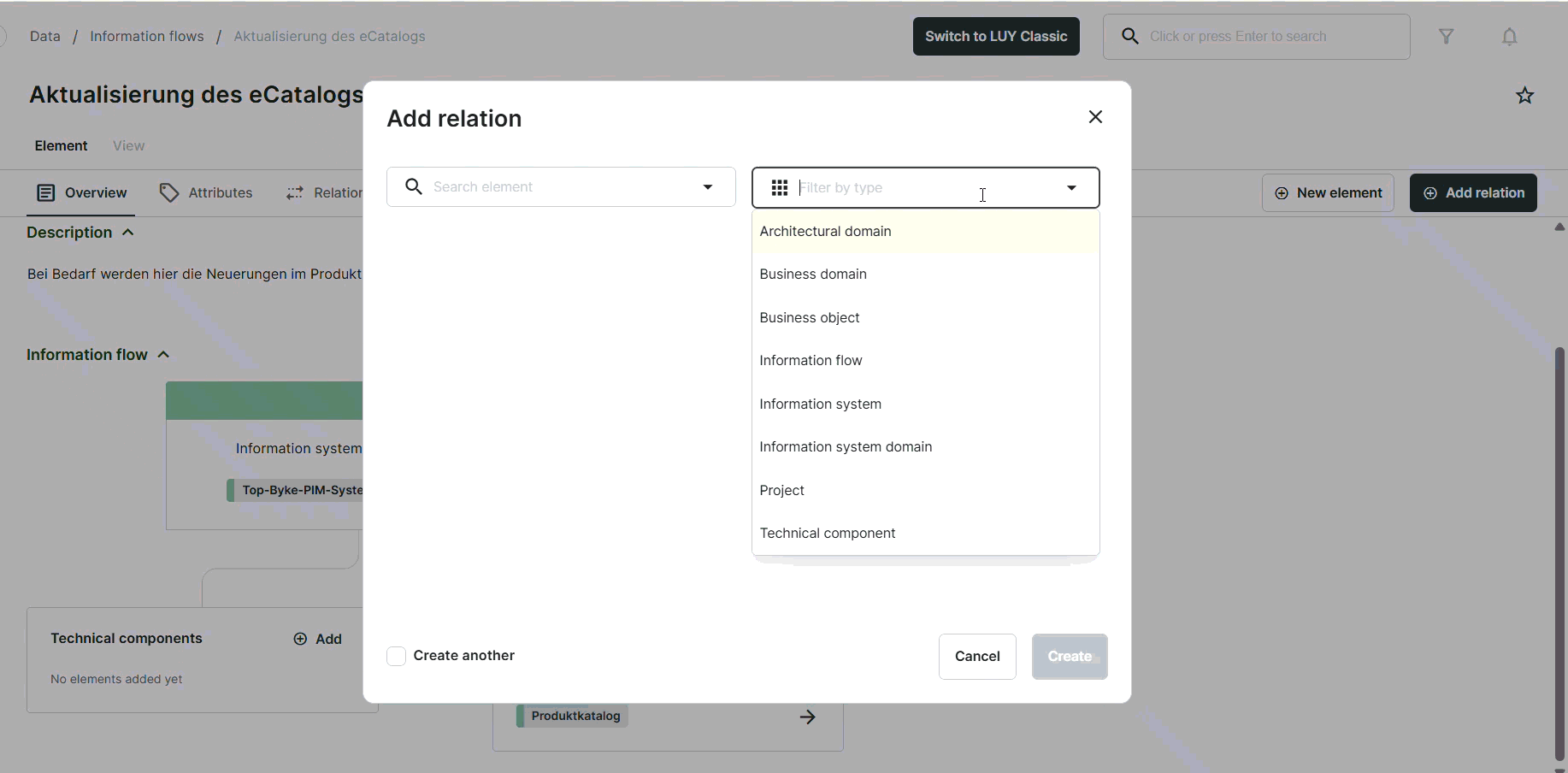
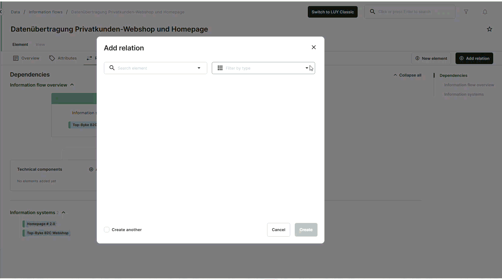
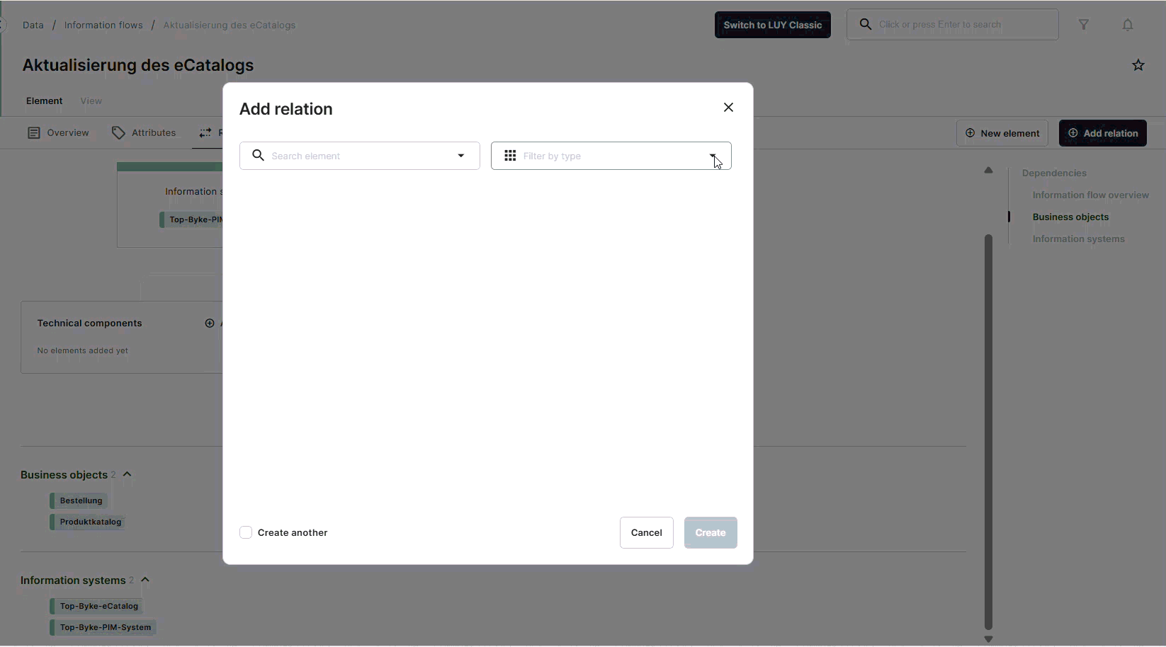
Add a new relation
Relations and self-relations can be added from the single element view using the “Add relation” button. This enables users to create new relations, including business mappings, for the element currently being viewed.
In the add relation dialog, users can:
Pre filter the list of available elements in the right hand drop down or type in the name of the desired element.
Specify which type of relation to use.
Add additional elements when creating a business mapping.
In order to create (and delete) relations, the user needs the permission to edit at least one of the two related building block types.
Newly created relations in the single element view are marked with a temporary visual ribbon on the relation badge to make them easier to identify and review. The marker disappears after the view is refreshed or when navigating away from view.
Add a new relation to the same building block type (self relation)
In the single element view, users can create relations between elements of the same building block type, such as parent–child relations (e.g. predecessor–successor).
When an element is selected, the LUY dynamically evaluates and displays all available relation types. Relation types are shown as enabled or disabled buttons based on their validity.
If a relation type is disabled, a tooltip explains the reason. Once a valid type of relation is selected, the save button becomes active. The dialog layout adapts accordingly and remains consistent across relation types.
Disabled self relation types – possible scenarios
A relation type may be disabled for one of the following reasons:
Already existing relation: If a relation to this element already exists, this option is disabled.
Preventing cyclic relations: A relation cannot be set as a successor if it is also set as predecessor. In this case the option is disabled.
Superordinate element or parent: An element can only have one parent relation.
Generalization of business objects: A business object can only have one specialized business object, but many specializing business objects.
Add a new relation: business mappings
When creating a business mapping, the dialog dynamically adjusts based on the selected elements, ensures only valid combinations are possible. It also enforces constraints to prevent invalid setups or duplicate mappings, so that only meaningful mappings can be saved.
Once created, the business mapping appears immediately in the relations tab.
Add a new information flow relation: information system
When selecting an information flow - information system relation in the add relation dialog, an overview of the selected information flow is displayed, showing its two currently related information systems.
To create the relation, users need to specify which of the two information systems (information system 1 or information system 2) should be replaced by the current information system. Simply click the "replace" button next to the desired position in the diagram. Once a replacement has been selected, the “save” button becomes active, and you can confirm your changes.
Visual markers are displayed to highlight newly created or edited relations between information flows and information systems
Add a new information flow relation: business object and technical components
When selecting an information flow - business object relation in the add relation dialog, an overview of the selected information flow is displayed, showing the selected business object or technical component in their section, inserted alphabetically.
For technical components the direction of the new relation can be changed, all other values in this view are fixed and cannot be edited.
Information flow - business object relation:
Information flow - technical component relation:
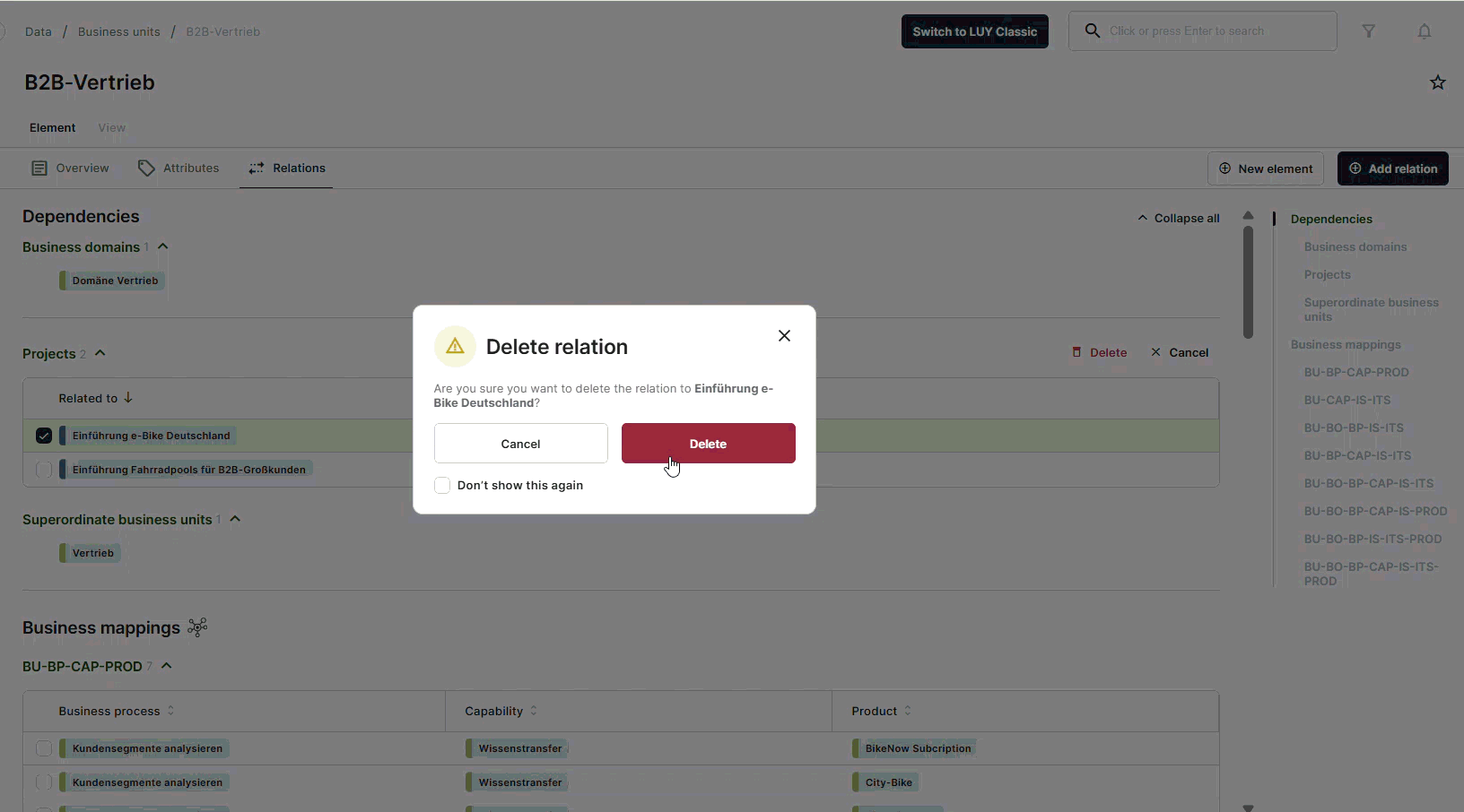
Delete relations
Users with edit permission for the currently displayed building block type can delete elements by selecting a relation via checkbox. Clicking the delete button in the corresponding section opens a confirmation modal that can be skipped in the future.
Only one checkbox per section can be selected at a time. Selecting another checkbox automatically deselects the previously selected one. If the active checkbox is deselected, all checkboxes are hidden again
Delete relations with additional attributes
Delete relations without attributes
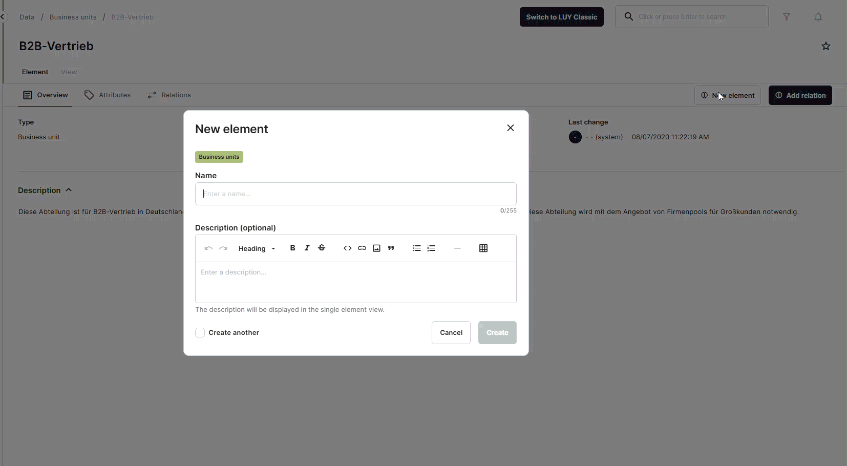
Create a new element
In the single element view new elements can be created by clicking on the button “New element”. The new element will always be of the building block type that is currently selected. Currently, there is no way to change the building block type in the create dialog.
In order to save the new element it has to have a unique name. Adding a description is optional.
Once created, the new element is immediately opened in the single element view.
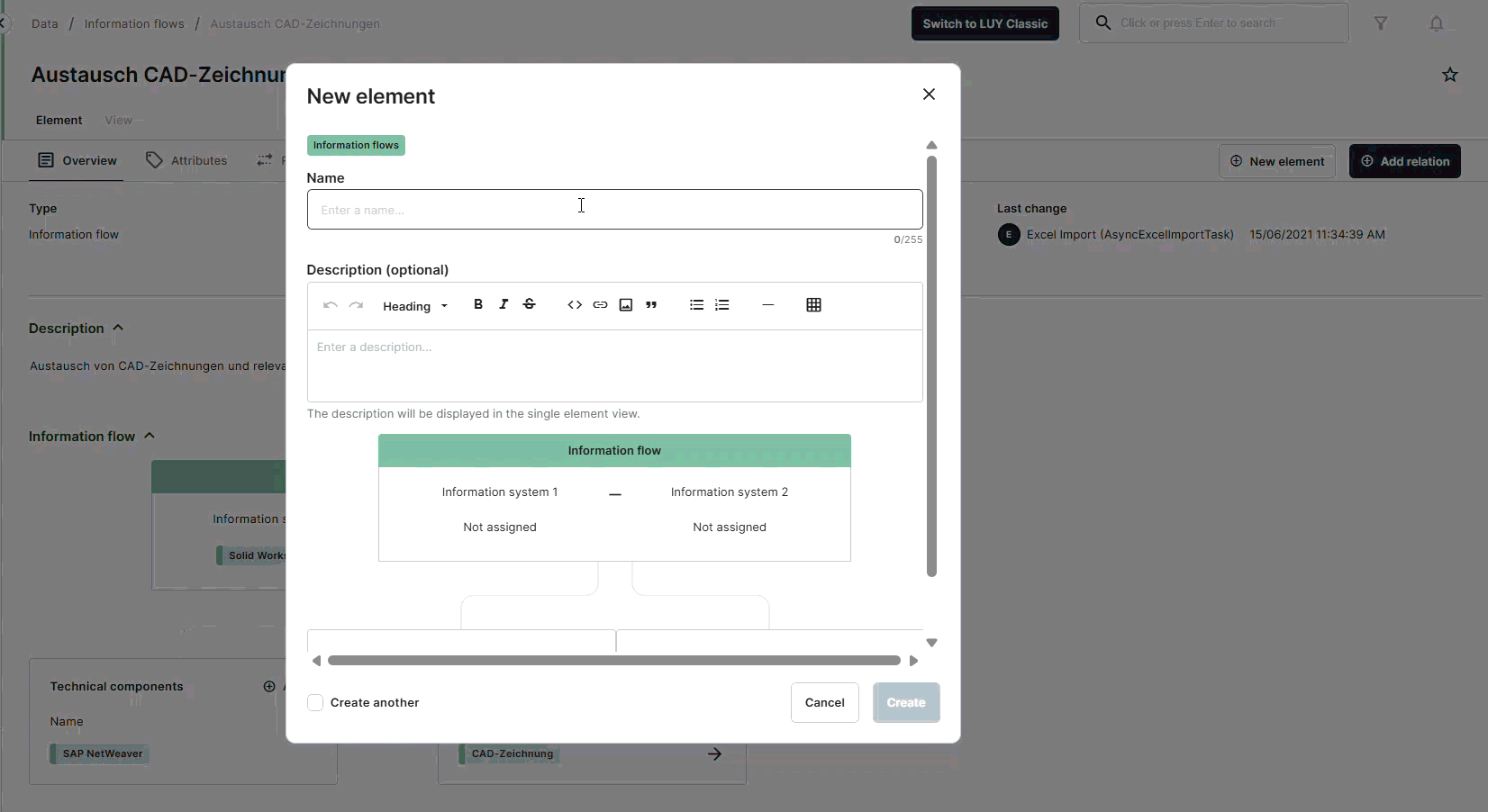
Create a new information flow element
Information flow elements can be created in the same way as other building block types.
To create an information flow element, click the “new element” button. The dialog opens with fields for name, description, and the information flow diagram.
The diagram is pre-filled with default values, with both information systems initially unassigned. The sections for technical components and business objects are displayed only if the user has read access to those building block types.
Only the name field is required to save the information flow. After successful creation, users are redirected to the new element in the single element view.
Subscribe to an element
In the top-right corner of the screen, a star symbol indicates the subscription status of the element. A filled star means the element is subscribed, while an empty star indicates it is not. Clicking the star allows the user to subscribe or unsubscribe.
When a user is subscribed to an element, the user will receive an email notification if changes are made to this element. However, if the changes are made by the user themselves, these changes will not trigger a notification or subscription related email.